Tuesday, 30 December 2014

Modelling the Test Head

In this entry I'll show you the work I've done for creating the test head model, which I will test out things such as texturing in photoshop and how I aim to piece it all together, so that I can use these workflows for my final models later on. 

So to start with, I took one of the concept iterations and modelled it in 3DS MAX. It didn't take me particularly long, roughly around 10 hours to make, edit and perform any tests that were needed at this point. You can see the model I created below:


I kept it colour coded to remind me what parts go where, and for example what parts could be modelled off the based head or would be better to be made separately. I'm quite happy with how the model came out overall as a test.

There were a few topology issues here and there, in particular the middle section that I segmented had to have the geometry flow around the entire model to make it work, so I had to make use of features such as the x-view and edge addition to deal with these problems. Whilst there's a few things that could be changed, it works for the purpose its being used for.

The topology total came to roughly 8,500 polys. I believe this is reasonable for this part, and I'll most likely go higher for future models, due to the fact if want to achieve a good realistic look I'll have to work with a greater amount of detail and higher poly count to achieve this.

With the head modelled I decided to perform some tests.The first was a part disassembly, wherein I took apart the model to show how all the pieces fit together, and hidden parts not previously viewable to the onlooker. I changed the colour scheme to a more appropriate industrial colour scheme, and too images from different angles to see which one would work best.


Through doing this I found that the first two angled perspective shots worked best, whilst the front and side on looks made it look boring, less visually interesting, and some parts couldn't be seen properly from these angles.

I feel that by producing something like this at the end result of the project would help give my designs a cool intricate and complex feel to their design, instead of just hollow shells inside. This is something I will continue to work on as the project goes on.

The other test I performed was to see how a translucent material placed on the outer shell in a light colour, with some basic block components placed inside would look. This idea follows the path as the disassembly would, as it still shows of all the complex parts in one go with the outer shell pieces. This idea is inspired by the armoured core series, as they use it as part of their game mechanics, and I thought it'd be a really cool thing to try emulate myself.

I started by applying a material top all the pieces I had already made, lowered its transparency, and applied an orange colour to it, also making the base colour white so that the lines would give it a good schematic look. I then made the basic shapes and added them into the model. Heres how it looks straight from max with no rendering done:


Here's the attempt that worked with rendering out from max, this took me a few tries to get right and messing around with the transparency levels:


And this image is a gain a straight capture from max without the wireframe on and the transparency lowered down:


I was quite happy with the first image, although this would only really work by taking the model out from max and doing post effect work on Photoshop. The second image grasps the concept, although the basic parts show up a little to strongly and part of the out layer was lost.

The final image, same as the second but taken straight from max, works a little better but again would require post effect work to be done to brighten it up and improve it. So I'll need to do further testing on this to try and get this technique right.

Overall I'm happy with this model so far. It matches the original concept image fairly well, and I found I needed to make a few changes and additions here and there to make it work better in a realistic sense. But its allowed me to test and try techniques that I can implement onto my developed models in the future.

More 3D work to follow in the next post.

Sunday, 28 December 2014

Pre-Production Work 7

Continuing on from the last entry, I have decided upon the final look for the company logo, as shown below on the right. I took reference from real life company logos, and simplified the shapes and colours in the design.


As a recap the rhino signifies the tough, bulky, armoured construction values of the tank and construction vehicle variants. Its all about the connotations the viewer gets from the images, and since the logo is usually one of the first things you see with a company, I wanted to make sure I got that idea across.

The lines and the three eye holes in the rhinos design represent the robotics part of the logo. I also decided to go for a green colour as it could go down the line of less fuel consuming or 'greener' robots, but mainly due to the fact I felt the green worked better for this. I may change the font, but I'm pretty set on it for the time being.

Alongside the completion of the logo the arms for the robot mechs have also been finished  and added to the final concept pieces, as shown below.


I was fairly set on what I wanted the arms to look like so I didn't change up the variety too much. Also the arms are more of a place holder then a definite final part of the machine, as I feel that different pieces would be more useful and make more sense for a realistic outlook.

So with these out of the way, the pre-production stage is pretty much finished. I'll most likely digitally paint the colours in at a later date, and deal with turnaround art when that point comes as well, since I'd prefer for the 3D modelling and texturing to dictate how they'll look.

So for the next blog posts be expecting some 3D modelling updates as I start to break down the components of these machines and start to fit them all together in 3DS MAX.

Tuesday, 16 December 2014

Pre-Production Work 6

So six days since my last  blog entry and I feel that I have gotten through a lot of the concept art that is needed to bring the project closer to the 3D modelling stage.

For starters, the leg section of the robotic mech is now finished. To create these sketches I grabbed a perspective screenshot from 3DS Max to help me draw out the design and drew over it for the basic shapes, then went into the proper detail of the designs. This was done due to the fact I haven't done much perspective practice, so by using the image it helped me to understand it better.

As you can see, by using a screenshot of my basic blockout model, it made it a lot easier to achieve a perspective view in my work. 

As you can see, the concepts went from looking bare bones to a more solid compact design.

I mainly used reference images of real life military vehicles, as the robotic mech will be used for both military and construction themes.

I was quite happy with what was produced, and additional pleased that I've come up with a simple yet bold background colour scheme to help better present my work with. Since it worked well with the legs this design was also applied to some of the earlier refined concept sketches.

The lighter tone on the sketch work on top of the dark grey backgrounds helps to bring out the designs.


With these parts done the final designs for each theme were started. Most of the components used a mixture of pieces from different concepts, whereas parts such as the head stuck to the original design chosen. Below shows the current stage each design is at.

Military design on the Left, and the Construction Design on the right

Again I made use of a 3D image of one of my basic blockouts from max to get the perspective roughly right. I also found that drawing on the smaller details and trying to get certain pieces looking correct was tideous, but were worth the time spent them as they add to the structure of the designs well.

Furhter work to be done for this particular piece will be an arm iteration sheet, picking the one I like best and then adding it on a different layer to these final designs.

Alongside the robotic mech concepts progress on the company logo has also been made. The next two images will show you the thought process and considerations I've made when creating this logo design.


I took the fourth image I created from the original four from the first screenshot on this work a while back, and tried out different shapes, colours and designs.

On the first row working out the facial shape, line breaks in the silhouette detail, and what the rhino head would be surrounded by was vital in order to get the logo right. I liked the design on the end with the diamond border and the head popping out, and decided to carry this on into the next iterations. I also wanted to give the rhino a mechanical look, to match the idea of a robotics company creating these robots.

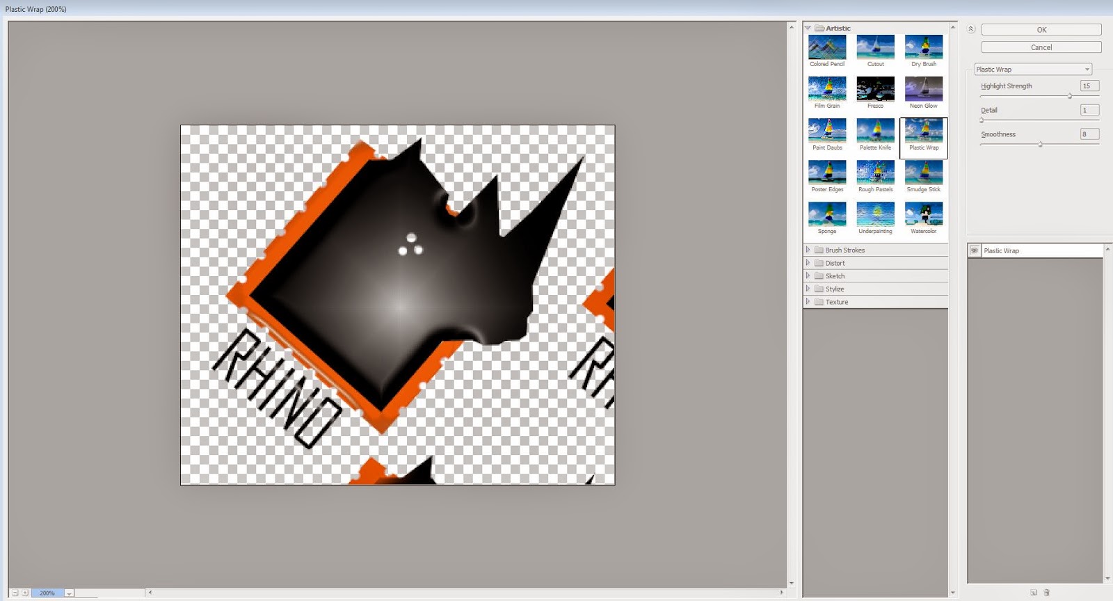
So for the next two rows I messed around with various ideas. I changed the diamond to a one colour layer, and punched holes on the edges to match the mechanical theme. For the rhino head colour panels were added, filters such as plastic wrap were tried, and even an artsy style was used, wherein I  used the polygon lasso tool to highlight different areas and used the exposure option to mess around with different lighting.

Example of the plastic wrap filter in action.

From this method I got closer to the final design that I wanted. On the last row I focused mainly on the block colours rigid shapes idea, and eventually got a design I liked (the 4th design on the last row) and went on to test a few ideas.

However I wanted to do further testing before deciding on a final logo, so another page was made to focus on the refined logos from the previous screenshot, as you can see below.


I again tested various shapes, colours and filters to try and get a fix on a final design. I'm particularly happy with the final three designs on the bottom row of this page, so will most likelly use one of them to create the final logo. In order to get the gradual colour effect, I used the Gradient tool and created different colour selections, selected the parts of the design that needed effecting and applied them to the design.

So as I mentioned at the start of this blog, I am pleased with the progress I have been able to make in the past six days, tying up many loose ends, such as the company logo, in a short space of time. For the next entry post, further concept art will be produced, and the final looks of the mechs and the logo will be finished.

Wednesday, 10 December 2014

Project Plan Revision and Pre-Production Work 5

Its been a while since my last post and unfortunately I don't feel iIve done enough work between the weeks gone by. Work for other modules and deadlines has taken up my time, so I have had to give serious thought to my my current project plan and what work is achievable in the time remaining for this project.

To this end I have made a revised version of my project plan. Luckily this still allows me enough time in that the second half of workload after Christmas won't be affected.


However, I've also made the decision to not make the robotic mechs totally realistic. What I mean by this is that I'm not going to learn all the ins and outs of say the engineering and scientific side of making these robots realistic, but instead stick to the aesthetic side of it, but also stick to the basic principles of making them work e.g. degrees of freedom, height considerations to real life vehicles, etc. But the main focus of the project will still be there, so the project deliverable won't change, which i'm happy to be sticking too.

Work that I've manged to complete includes further concept art for mech different parts, which include the head and torso parts.

For the head I made several iteration designs and  picked out 4 of the ones I liked to attempt to combine together. The first head looked too much like a gun and I immediately abandoned that concept. Instead, since the company building these robots is named RHINO, I decided to create one based off of the animal as well. I didn't want to go for a generic anime type head, so felt that these designs were more unique to my project.


The shapes were largely influenced by construction vehicle shapes, as I feel their shapes worked better for the design I was going for. Again like I did with the arms areas that can rotate or move in red, helping me to separate the armour parts from the inner workings.

With this done I selected the 3 heads I wanted to take further and drew them out with iterations, varying the looks of the armour, movable parts and inner workings.


I haven't yet to decide which head i'm going to use, but i'm happy with the selection I've created.

For the torso's I looked at the ones created for the side view concepts, and redrew some of them in a 3D perspective for both themes, and created a few extras for variety. I'm aiming for a fairly chunky design to reflect real vehicle designs


Again I haven't decide on the final pieces as of yet. This will be done once I've done iteration work for all the parts, so once the legs are finished I will form up the final design, essentially kitbashing it together as I did with the basic 3D models.

A point that I would like to highlight is that I will be properly exploring the technical parts needed when the proper modelling stage. I'll still aim to cover this in the 2D stage, however I feel that spending too muh time on the small details now will have a huge negative effect at the later stages, so the conceptual stage is more for a rough basis.

Lastly, on the research stage, I have found the website Pinterest to be incredibly useful for gathering an image database. Its a site that allows you to floor and create boards, where you 'pin' images that you've found from websites or uploaded yourself. So in order to aid my project I have put up images artistic reference images of robots from various artists around the web, both to aid my current project but to also help  me for future projects that I do.


On reflection, i'm still gathering the ground work out my designs. Whilst I have fallen behind schedule, I aim to make a come back and finish all concept art before new year. So for the next post, further conceptual work will follow.


Thursday, 27 November 2014

Pre-Production work 4

Carrying on from last weeks blog,I have decided upon the 6 types that I would like to aim to create throughout the his project, as I stated I would in the last entry. It will be three types each for each theme, and are as follows:

Military:
.Main Battle Tank
. Missile Launcher
. Communications Satellite

Construction:
. Excavator
. Digger
. Wrecking Ball

With this decided it make it easier for me to select what parts I will have to model for my robot mechs, as well as to tailor the designs to each areas specific needs.

Carrying on from this decision, I continued pre-production work by testing out different colour schemes, one set for a military based robot mech, and the other for one based around a construction theme.

The process to do this was pretty simple. I tank one of the designs from both themes into their own pages, grabbed one of the references images and color picked from those. I used layers to make it easier to get all the colours in without fussing around too much.  Below is an example of the work in progress.

Example of WIP: Pick the colour scheme from the reference, use the main colour as the base layer, put the picked colours to grab for adjustments, build it up into the necessary pattern.  

And here we have the finished colour schemes for each.

Tank Colour Schemes

Construction Colour Schemes

I really like the more detailed patterns for the tank's colour schemes, such as the digital and mud pattern camos. Their was a great variety to choose from, and I felt I chose the best ones that appealed to my idea out of my reference images.

For construction the colours were a little more basic, with construction vehicles generally having block colours to be easily seen and distinguished. I personally like the red colour scheme the best, so its the one i'll most likely be going with this one.

Alongside this I also started work on a company logo for my robot mechs to be a part of. Since I want to make this project as realistic as I can, a company that actually makes these machines fits the bill the best.

For the name I wanted to go for animal with connotations of a tough, reliable and anatomically strong to connote the robots own strengths. For this purpose I decided to go with a rhino, and started to create a few logo designs. I also found am referencing actually companies using a rhino as their logo, as well as an image of a rhino itself.

Current work is focusing on the silhouette of the rhino logo. 

This is still a work in progress and will be updated upon as the project goes on.

So having looked into the colour schemes and the prospect of a logo for my work, I've decide to move towards the more technical aspect of my concept art: working out the inner workings for my robot mechs designs.

So far I've done work into the robot arms that will come as a standard part for both the military and construction themes.

The red areas show the moveable parts of the arm. The green highligh areas that i've done for two of the arms shows the armour that would cover them. I also worked on various finger shapes, as hands in general aren't my strongest point. I feel a little more confident having practiced these different designs. Also as you can see the highlighted arms show you the design that i'm most happiest with and will go on to develop for the final designs.

In addition this I have also been practiced modelling general robotic and mechanical parts which I fell will come in handy when it comes to modelling the robot mechs in the later stages. Below are a few screenshots of parts I've been working on to help with my ideas.

I've looked at things such as tank wheels, construction digger lights, and creating a simple metal panel.

I also modeled different shaped screws, bolts and nuts, and found a useful tutorial in order to get the correct shape. 

I've looked at robots from one of my artists Keith Thompson, and have practiced modelling its structure for Armour creation practice. 

And i've looked at real life reference for modelling as well. I started modeled an abrams tank using a  schematic I found online. This has been useful for working out shapes from real life reference. 

And finally, i've also done research into useful artist references that I aim using to help my art work. My main reference is Keith Thompson, a fantastic robot artists amongst other things, who has his own book on how to concept a robot, taking into consideration things such as backstory, materials and mechanical components.

I've also found a few other handy artists that can help me with my work, or whose general style could help influence my own work. Below are some image examples and website links to show you what im using, and to give you the opportunity to look at them yourself.

http://www.keiththompsonart.com/robots.html


http://www.emersontung.com/


http://www.artofben.com/Robotics-Weapons


With these artists I feel that'll really help with my concept creation of my own robot mechs, as well as give me an understanding as to how much detail I want to put into them.

For the next entry I will continue to focus on working out the inner workings for the robot mechs, as well as head towards the final designs that I will use for my project.

Sunday, 23 November 2014

Pre Production Work 3

In this entry I will be showing the further research and development of concept art that has been done for the robot mech designs.

To start with I continued to research areas that will act as good reference for my designs, and add to my overall image database. I've looked at mechs in TV, specifically in anime for the time being, as there are thousands of designs to look at. For real life I've added the Vehicles section to the image database, and have started to look at construction and military machines, as these will be a key vocal point for concept art work.

Here are the links for websites where I found my images if you wish to look further into the subject areas:

http://gundam.wikia.com/wiki/The_Gundam_Wiki - Anime mechs
http://www.military-today.com/tanks.htm - Military vehicles
http://www.machinefinder.com/ww/en-US/machine/3411459- Site that sells construction vehicles and has lots of useful images
http://www.trucks-cranes.nl/english/cranes/demag.html - site with image of trucks and cranes

Mechs from Anime, which has a rich variety to use as reference.

Vehicles from Military, which has helped with my mech deisgns.

Vehicles from Construction, which looks at machines such as excavators, diggers and compactors. 

With this to help back up my designs, I also quickly put together a moodboard looking at the different areas of the robot's design that I will need to consider in order to make it as realistic as possible. I feel that with this as a constant reminder I won't stray off into creating overly crazy or non-functional designs for my concepts.


This moodboard shows you the different references and areas that I am considering for my overall art work. 

With this done I've gone on to create two lots of concepts based off the final four robot blockout chosen from the last post entry. Here's a reminder if you haven't looked at them already.


Final 4 robots

I made heavy use of reference from my real life military and construction machine research. I've looked at and referenced their shapes, components and size considerations in order to try and add to the realism of my designs. They particularly came in handy when it came to parts such as lights, caterpillar tracks and armour plating styles.


First lot of concepts

Second lot of concepts

Also through my research I've had to take into consideration what roles each mech would perform. With the different customisable parts I will have to make sure that the basic components can be changed easily. To this end, based of research and consideration moodboard, I've listed and looked at the parts that I have placed into my design for the first batch of robot mechs.

Concepts with notes

At this point I aim to whittle down the selection from 11 designs. Additionally I will create list of 3 job roles in both the Military and Construction industries that I will focus my main design on, which will help to decide on a final look and what changeable parts I will have to create.

So next weeks post will focus further on pre-production work for these designs.