For starters, the leg section of the robotic mech is now finished. To create these sketches I grabbed a perspective screenshot from 3DS Max to help me draw out the design and drew over it for the basic shapes, then went into the proper detail of the designs. This was done due to the fact I haven't done much perspective practice, so by using the image it helped me to understand it better.
 |
| As you can see, by using a screenshot of my basic blockout model, it made it a lot easier to achieve a perspective view in my work. |
 |
| As you can see, the concepts went from looking bare bones to a more solid compact design. |
I mainly used reference images of real life military vehicles, as the robotic mech will be used for both military and construction themes.
I was quite happy with what was produced, and additional pleased that I've come up with a simple yet bold background colour scheme to help better present my work with. Since it worked well with the legs this design was also applied to some of the earlier refined concept sketches.
 |
| The lighter tone on the sketch work on top of the dark grey backgrounds helps to bring out the designs. |
With these parts done the final designs for each theme were started. Most of the components used a mixture of pieces from different concepts, whereas parts such as the head stuck to the original design chosen. Below shows the current stage each design is at.
 |
| Military design on the Left, and the Construction Design on the right |
Again I made use of a 3D image of one of my basic blockouts from max to get the perspective roughly right. I also found that drawing on the smaller details and trying to get certain pieces looking correct was tideous, but were worth the time spent them as they add to the structure of the designs well.
Furhter work to be done for this particular piece will be an arm iteration sheet, picking the one I like best and then adding it on a different layer to these final designs.
Alongside the robotic mech concepts progress on the company logo has also been made. The next two images will show you the thought process and considerations I've made when creating this logo design.
I took the fourth image I created from the original four from the first screenshot on this work a while back, and tried out different shapes, colours and designs.
On the first row working out the facial shape, line breaks in the silhouette detail, and what the rhino head would be surrounded by was vital in order to get the logo right. I liked the design on the end with the diamond border and the head popping out, and decided to carry this on into the next iterations. I also wanted to give the rhino a mechanical look, to match the idea of a robotics company creating these robots.
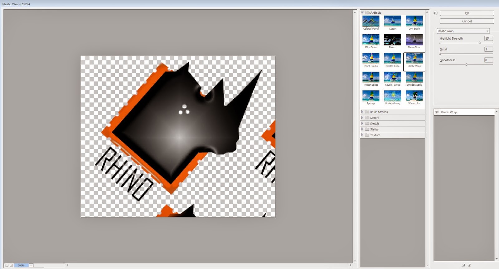
So for the next two rows I messed around with various ideas. I changed the diamond to a one colour layer, and punched holes on the edges to match the mechanical theme. For the rhino head colour panels were added, filters such as plastic wrap were tried, and even an artsy style was used, wherein I used the polygon lasso tool to highlight different areas and used the exposure option to mess around with different lighting.
 |
| Example of the plastic wrap filter in action. |
From this method I got closer to the final design that I wanted. On the last row I focused mainly on the block colours rigid shapes idea, and eventually got a design I liked (the 4th design on the last row) and went on to test a few ideas.
However I wanted to do further testing before deciding on a final logo, so another page was made to focus on the refined logos from the previous screenshot, as you can see below.
I again tested various shapes, colours and filters to try and get a fix on a final design. I'm particularly happy with the final three designs on the bottom row of this page, so will most likelly use one of them to create the final logo. In order to get the gradual colour effect, I used the Gradient tool and created different colour selections, selected the parts of the design that needed effecting and applied them to the design.
So as I mentioned at the start of this blog, I am pleased with the progress I have been able to make in the past six days, tying up many loose ends, such as the company logo, in a short space of time. For the next entry post, further concept art will be produced, and the final looks of the mechs and the logo will be finished.


No comments:
Post a Comment